Why is a great web design so important? What’s wrong with a cheap, budget-looking site anyway, surely it won’t affect my sales, right?
Um… I’m going to have to say WRONG! Many small businesses start out with a cheap, fast knock-up site, either built by themselves or by a web developer offering an amazing site on a budget. While a good site can still be built on a budget, if the development process has been hastily overlooked, you’re pretty much left with a white elephant….a lemon of a site. And no-one wants that. Afterall, an effective website will generally:
- Be the friendly, welcoming face of your business
- Instruct viewers on what to do next – this is known as a Call To Action
- Call Now
- Buy Now
- Email Us
- Find Out More
- Subscribe
- Provide viewers with relevant information matched to their search requirements
- Drive sales (and profits)
- Create expertise, authoritativeness and trustworthiness
First Impressions Count
When people first click into your site, it’s all about that first impression. Did you know that 75% of website viewers make a judgement call about a business’s credibility based purely upon the visual aspects of that site? If your business website looks outdated, clunky and oh-so boring, it’s estimated that you’ll lose around 40% of prospective clients. Wow, that’s a big hit to your online credibility!
User Experience
The most common reasons someone visits your website is to:
- Discover product or service information
- Research your About Us page
- Find contact information for your business
Your site needs to make this easy for your viewers. Remember, today’s viewers’ online patience is very low, if they can’t find something fast, they’ll quickly tire and go elsewhere.
As well as having the information easily accessible, it needs to aesthetically pleasing to the eye. If the layout is messy, if the images and font are an eye-sore, it will leave a negative impression and, again, drive people to your competitors’ websites.
Website Navigation and Conversion
When providing navigation options for your website, the easiest and shortest route between two points is best. Having said that, if you have loads of products, don’t overwhelm people with a massive drop-down menu, instead take them to a page and break it down from there.
If you have Call to Action (CTA) buttons throughout your site, make sure your viewer knows exactly what pressing that button will do. Don’t overcrowd your pages with too many options, try and have one clear objective on every page view.
Below is an example of website with a clear and concise CTA. The other example is, well, rather cluttered and confusing.


Mobile Friendly Websites
Given that an increasing majority of searches and subsequent website views are conducted on mobile phones, it’s crucial that web developers create sites that have a strong appeal in mobile layout AS WELL AS desktop view. There’s no point in making one version look great, only to have the other looking awful.
Another critical factor is site loading speed. Desktop views generally load faster due to the type of connection. If a site isn’t tested and optimised for speed in mobile versions, it can have a negative impact on the viewer’s experience.
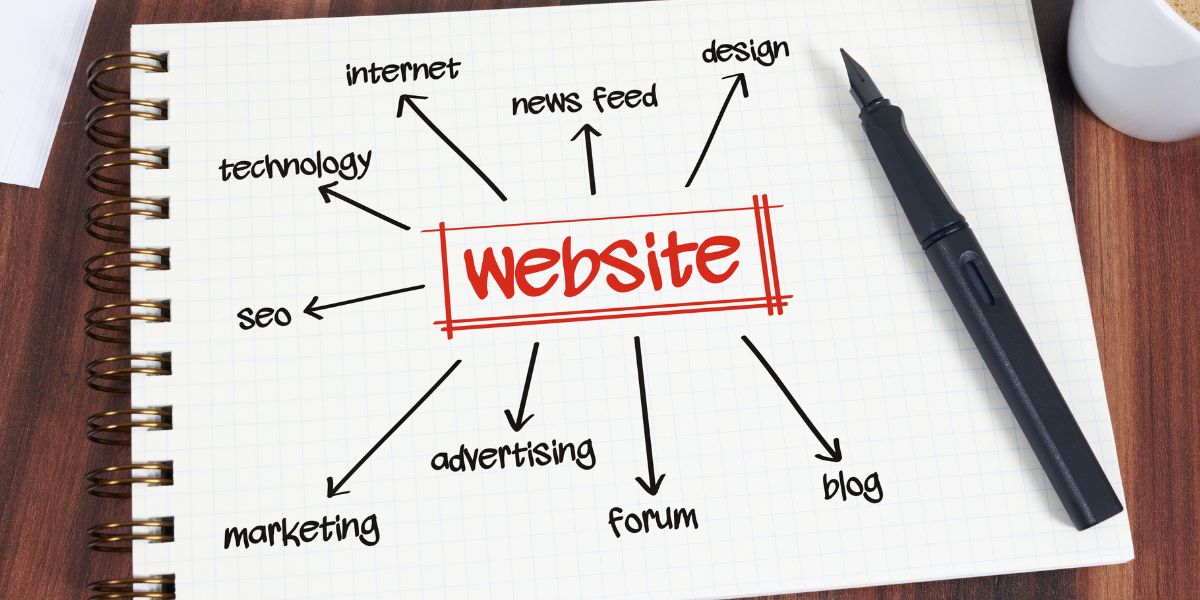
SEO
There’s more to a great website than the visual elements of each page. While a flashy, blingy site can look amazing, the extra code required to carry out those functions can really slow a website down. Website content plays a huge role in a highly ranked page.
Google search algorithms are continually looking for ways to improve the user experience and looks at the overall flow and perceived intent of each page. As a result, a poorly implemented Search Engine Optimisation (SEO) strategy on a web page may result in a lower ranking on a Google Search Engine Results Page (SERP).
So we now know ‘why’ a well designed website is so important for increasing your digital footprint, but what actually makes a site well suited for increased traffic and subsequent conversions? Let’s take a look below.
Want to know what makes a great website?
There’s a lot more than pretty pictures, colours and fonts that go into a ensuring a website has a good design.
Many small business owners get excited about the idea of building a shiny new website, however they often get distracted by the aesthetics, with no thought given to functionality. As a result of this oversight, they will end up with a website that might look ok, but it doesn’t function well at all. Bounce rates are generally higher because the site’s intent is confusing. Furthermore, if the website is poorly optimised, it’s unlikely they’ll ever appear on page one of a search engine results page (SERP).
Let’s dive into the core elements that make up a great website
The key purposes of your website
- Builds your brand image
- Sells your product/service
- Collects/gathers information (leads)
Next let’s look at website structure
Your website structure is how different pages on your site are organised and link together and generally serves two purposes:
- To offer a great UX (user experience). We want to make it as easy as possible for visitors to find what they are looking for and to know what to do next.
- Assists with SEO as it makes it easy for Google to crawl your site.
How to know the right website structure for your business
To help you figure out the right structure and layout for your website, the first step is to know your customers. Remember, your website is here to serve YOUR CUSTOMERS, so everything we include on the website needs to make sense to them.
So, if you haven’t done one yet, make sure you’ve developed a Customer Persona as this will help determine your website layout.
Your layout will also be influenced by the type of content you are showcasing. An e-commerce site will have a different layout to a traditional service-based business.

Types of pages you might include on your website
Homepage
This is your main page of your website hierarchy and the place most website visitors will land. Your homepage is your business overview. It needs to showcase:
- What problem you solve (what you offer)
- Who you help
- What action you want them to take
Your website homepage often provides the first impression of your business. As such, you’ll have just a few short seconds to make a big impact.

The most important aspect of your homepage is that within those first few seconds, your visitor needs to know WHAT YOUR BUSINESS IS ABOUT and HOW YOU ARE GOING TO SOLVE THEIR PROBLEM!
I’ve included some elements you might include on your website homepage below. Just remember, more isn’t necessarily better. Make sure it is easy for users to know what action you want them to take.
Elements to help you create your perfect homepage
HEADLINE – You only have a few seconds to let your visitors know what your site is about. Your headline needs to be CLEAR AND SIMPLE and above the fold (the point where a person needs to scroll). Your headline is most probably one of the MOST important aspects of your homepage, so take your time creating this.
SEO Tip – Your main headline should be H1 and be your keyword for that page.
SUB HEADLINE – Brief description of what you do/offer. Focus on one pain point your ideal customer might have and how you will solve it.
SEO Tip – This could be a H2 or H3 – If practical, you could include a variation of your keyword or keyphrase.
PRIMARY CALLS TO ACTION – The goal is to get your visitors to DIVE DEEPER into your site. Include 2-3 CTAs that are above the fold (scroll point). Make your CTA visually appealing and in a different colour to the rest of your homepage. Brief description (no more than 5 words). Examples – Sign up, Try it for Free, Make an appointment, See the menu, Programs.
TIP – Think about WHERE you want your customers to go after the homepage, what is the ONE button you want them to click. Make that obvious.
IMAGES – Should clearly showcase what you offer. Images that capture emotion are great. (Ideally not stock images!)
SEO Tip – All images should have an Alt Text – This tells Google what the image is about. Without an alt text on the image, Google cannot read images and all those pretty pictures on your site will be useless in helping to tell Google what your website is about.
BENEFITS – What are your customers going to get from working with you? Keep it easy to read in the language of your customers.
SOCIAL PROOF – Quotes, images. Ideally, include a name with your testimonials to make them more credible. Social proof is a powerful indicator of trust.
SEO Tip – Install a plugin that allows your Google reviews to showcase on your website.
LOGO – Usually in top left hand corner in your menu bar.
LINKS TO SOCIAL MEDIA – Can be in the header or footer.
Optional – Features/product comparisons
Optional – Resources – Most website visitors will not be ready to buy on their first visit. Give them a reason to stay or come back by offering resources, blogs are great for this. It also helps to build your expertise and authoritativeness.
Optional – Success Indicators – Any awards you might have. As seen in…. etc.
Simple Homepage example – This is a large e-commerce site, however they make it clearly obvious they either want you to shop ‘women’ or ‘men’ or do a search.

Services and Product Pages
This is where you can showcase your product and services and go into MORE detail. These can be more like a sales page where you present your offer and really SELL IT.
Tips – If you are selling products online, ensure your purchasing process is EASY. The less steps the better. Make it EASY for your customers to make a purchase or contact you.
If you are building an e-commerce website and have loads of products, try and group them into categories and subcategories.
Website Navigation
Give visitors a clear path into your site from your homepage. Keep your navigation at the top of the page. Don’t try and get fancy and do different things with your navigation, most website users EXPECT a menu at the top of the page and if they can’t easily find a way to navigate through the site, you will lose them.
Tips:
- Keep your menu simple and uncluttered
- Use short phrases
- Use simple language
The example below is Apple’s website. They have a lot of pages and content as you can see by the menu in the footer, however they have kept their main website navigation simple so users can easily navigate through the site.

And before I forget, the NUMBER 1 THING you need to think about before going crazy designing is how are your customers going to find your website.
Ultimately, you are going to need to optimise your site for your keywords (the search terms your ideal customers use to find your service/product) and you need to think about this BEFORE you start creating your website.
Why?
Well, because your URLs, site structure and layout will all impact how Google’s algorithm reads your site. If you’re design is ordinary from the outset, you’re simply making it so much harder to be found high up on any SERPs. Get it right from the get-go and you’re and you’re half way there.
If you need a hand planning out a great website, simply book in for a FREE Strategy Session.